Production Diary for Website
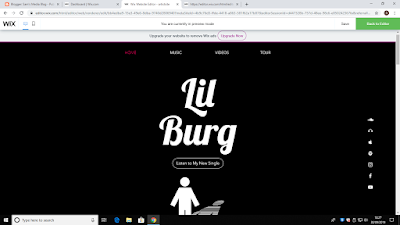
This shows the basis for my homepage on my website. I have chosen to include my artist's logo on the main page as it solidifies who's page it is and gives the audience a greater understanding of the artist's persona. This can include the dark colours I have used, for dramatic effect, and the proportion of the image compared to the writing around it. In the navigation bar I have chosen to use four different links to various information any viewers wish to pursue. Similarly, I have decided to add social media links on the right hand side, they will be used as links for the audience to view any opinions they may have to do with artist, it may also be used to ask any questions. I have set the social media bar so that when a viewer scrolls up or down, the navigation bar remains on the right hand side. The reason I have done this is to show the importance of contacting the artist through social media as its allows constructive criticism to be shown to the artist. This will allow them to grow as an artist and a person.
This screenshot appears on the same page as the one above, for this section I've included an image relevant to music and moreover I will include a link/viewing of my selected song (Sunflower). In terms of colour contrast, I have chosen to brighten the colour from black to purple, the reasoning behind this is that I want it to fit with the message I'm aiming to prevail in my music video. Being that I want to show an improvement in emotions from sad to happy. I believe the colours will help portray this as they rectify emotions, dark suggesting sadness and as the website progresses the colours become more vibrant and I hope this will represent a change to happiness.
The final section of my home page includes a link to information about tour dates and shows. I am developing an idea that I'm going to display this section on it's own page in that I'm only going to have two pages on the finalised website. The reason I have chosen to do this is that I think one of the most important aspects of a artist's uprising is having a secured audience by producing live events to increase national/global recognition. I have similarly used a relevant image to help solidify the importance of this specific information.
This screenshot appears on the same page as the one above, for this section I've included an image relevant to music and moreover I will include a link/viewing of my selected song (Sunflower). In terms of colour contrast, I have chosen to brighten the colour from black to purple, the reasoning behind this is that I want it to fit with the message I'm aiming to prevail in my music video. Being that I want to show an improvement in emotions from sad to happy. I believe the colours will help portray this as they rectify emotions, dark suggesting sadness and as the website progresses the colours become more vibrant and I hope this will represent a change to happiness.
As you can see, the colour scheme has changed dramatically
as it’s further changed to a brighter colour. I believe this sets the forefront
to the main concept of my website, the music video. I have in addition, added an image to help create a more energetic atmosphere to my website. I have
also included a link to the music video itself which will be posted on YouTube,
this will therefore give the audience greater recognition of the artist and the
music they create.


Comments
Post a Comment