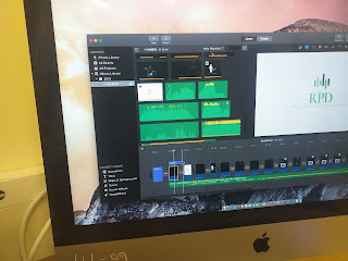
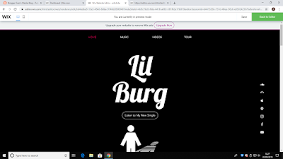
This is a screenshot of my original website, due to it being the first thing that a viewer will see, I took it upon myself to make attractive and eye catching. Therefore, I decided that my original idea was dull and resultantly changed the background to a smoke type effect. I believe this added a different visual aura and was more eye catching to the viewer. Similarly, I decided that having that many social media links on the right hand side of the page could become too confusing and too complex for the demographic I'm aiming to attract. Some of the social media links are to platforms that people of a younger age might not have access to these apps. I therefore reduced it to a fewer amount of the more popular social media platforms in order to make it easier for viewers to access any information. Equivalently, before any changes were made, this image as seen on the left was a still picture. I therefore decided to change it to a dynamic image, I believe this has adde...


